


When looking into colour trends for kitchens in 2026, many owners may expect to find a short list of the most popular shades. In reality, kitchen trends for 2026 go beyond a list of “on-trend” colour and style choices. Instead it is about applying the right form, function and flow to the home to create visual cohesion across connected spaces.
With more Australian homes moving towards open-plan living, kitchens no longer exist by themselves. The design choices made in the kitchen need to translate and flow into the rest of the home seamlessly. As a result, the colour choices made in the kitchen can change how the home looks and feels as a whole, making it one of the most important decisions for your kitchen build.
In this blog, we will cover the kitchen colour trends for 2026 and how to best pair colours for long-lasting results. With over two decades of experience in designing and building custom kitchens and joinery, we will guide you through the top kitchen colour trends to look out for in 2026.
How Colour Forecasts Influence Professional Kitchen Design
As more people are shifting their design goals to how they want to feel and move within the home rather than hopping on colour and design trends, colour forecasting is used as a directional tool by designers to understand this shift.
Colour forecasting helps designers understand:
- How lifestyle changes influence kitchen design
- The emotional response homeowners are seeking from their spaces
- The balance between warmth, calm, and contrast
Homes are shifting towards wanting kitchens that feel grounded, warm and connected to everyday living. Strategic colour selection helps support this. Earthy tones and warm neutrals bring warmth to the home, whereas bright, bold colours communicate energy and movement. By understanding how people want their home to feel and function, designers can use colour forecasting to create kitchens in line with these emotional and practical needs.

The Three Colour Directions Shaping Kitchens in 2026
Colour kitchen trends for 2026 can best be understood through the broader colour directions we are seeing evolve. These help create a framework for building colour palettes that can be transferred across many kitchen styles and designs.
Here are the three directions we are seeing take place in 2026:
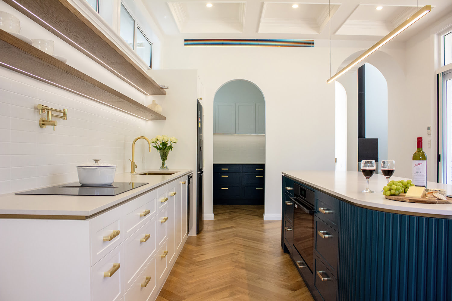
Direction One — Expressive Warmth and Individual Character
Integrating warmth and character into the kitchen design brings depth and personality to the home. Colours in this design trend feel richer and more layered, steering away from generic finishes.
In this design direction, it works best when colour is used on:
- As a kitchen island feature that anchors the space
- Lower cabinetry paired with lighter or neutral uppers
- Pantry or appliance zones treated as focal elements
Integrating neutral benchtops, splashbacks and soft-toned walls can balance the richer tones. These elements support the kitchen in feeling grounded and full of character without being overwhelming.

Direction Two — Grounded Neutrals and Soft Structure
One of the most important shifts in colour trends for 2026 is moving away from the stark whites and cool greys, moving towards warmer, softer neutral tones.
This direction focuses on tonal variation and moves away from strong contrast by:
- Subtle shifts between cabinetry and walls
- Gentle layering of warm neutrals
- A calm backdrop for natural stone and timber
Best applied in open plan kitchens where a cohesive design is essential for flow across spaces. This direction is popular among homeowners looking for longevity, flexibility and broader appeal.
")
Direction Three — Lightness, Softness, and Subtle Colour
Instead of bringing bold colour statements into the kitchen, this directly brings low-saturation tones and soft transitions without overpowering the home.
It is most effective when applied intentionally, such as:
- A single run of cabinetry
- Secondary zones, such as pantries or breakfast areas
- Feature splashbacks paired with neutral cabinetry
By balancing warm neutral tones with refined finishes, these kitchens feel calm and sophisticated.

Creating a Cohesive Kitchen Colour Palette
In 2026, kitchen colour trends are less about one standout element and more about how colours work together as a system. When cabinetry, surfaces, and walls are planned holistically, kitchens feel calmer, more cohesive, and more timeless. Treating colours as a complete system rather than an isolated decision helps you achieve a cohesive palette.
A cohesive palette looks at:
- Cabinetry
- Benchtops
- Splashbacks
- Wall colours
- Hardware, fixtures, and appliances
It also establishes a clear hierarchy of colour. For example, start by choosing one dominant colour direction and use the supporting tones sparingly. This approach creates kitchens that feel resolved, balanced, and far more likely to stand the test of time.

Longevity in Kitchen Design — Moving Beyond “Trendy vs Timeless”
Why No Kitchen Is Ever Truly Trend-Proof
No matter how carefully kitchens are designed and colour selected, no space is ever trend-proof. However, there are ways to thoughtfully extend the life of your kitchen design.
Kitchens that stand the test of time share common traits such as:
- Well-considered proportions and layouts
- High-quality materials and finishes
- Intentional use of colour
Smarter Ways to Use Colour Without Regret
Integrating colour into interior design is all about applying colour subtly, where it can bring spaces to life.
Designers often reduce colour risk by:
- Using two-tone cabinetry
- Introducing colour through a kitchen island
- Anchoring the space with neutral foundations
By taking these strategies, interior designers and homeowners can add colour to spaces without overwhelming every surface.
Resale Considerations Without Compromising Design Integrity
In Australia, resale value is a common concern for many homeowners, but going for plain or stark white kitchens can result in kitchens feeling flat or unconsidered. Well-designed kitchens integrate colour and select high-quality finishes without overwhelming spaces. This creates kitchens that stand the test of time and stay well-maintained.

Why a Custom Approach Offers Greater Freedom With Colour
Many kitchens rely on the standard palettes offered by flat-pack or standard kitchen designs. While convenient, these options can limit colour choice and restrict how well the kitchen integrates with the rest of the home. A custom kitchen removes these limitations, allowing colour and finish selections that are tailored to your space.
A custom approach offers flexibility in:
- Cabinetry painted in any colour, rather than a restricted range
- Polyurethane finishes are available in matt, semi-gloss, or gloss
- The option to work with premium paint alternatives, such as Porter’s Paints
At Vitality Kitchens & Joinery, we work closely with you to establish the right design direction, ensuring your cabinetry colour choices align with your home’s palette, lighting, and overall design vision.

The Importance of Finish in Kitchen Colour Design
In 2026, designers are favouring softer contrasts, warmer undertones, and finishes. While colour selection is important, the finish applied to cabinetry equally plays a critical role in how that colour is ultimately perceived.
- Matt finishes soften colour and reducing visual noise
- Semi-gloss finishes balance durability with refinement
- Gloss finishes introduce reflection and architectural contrast
Finishes also influence how colour responds to natural light. Australia’s bright sunlight can significantly alter the appearance of both colour and sheen throughout the day, making finish selection an essential part of creating a kitchen that looks and feels right long term.
Common Kitchen Colour Mistakes to Avoid
Here are some common mistakes to avoid when choosing colours for the kitchen:
- Choosing cabinet colours before materials are finalised
- Ignoring how natural and artificial light changes throughout the day
- Applying colour too broadly instead of with intention
- Overlooking the role of finish and texture
- Locking decisions in too early in the design process

Designing a Kitchen Colour Scheme That Will Age Well
Kitchen colour trends are no longer about designing with a narrow palette. Instead, they consider the home’s interior as a whole. From natural tones paired with warm neutrals to nature-inspired hues that bring depth and warmth, kitchen colour directions for 2026 focus on form, flow, and function. As we have seen, colour forecasts should be used as guidance, not rules.
The most successful kitchen colour schemes respond to:
- The home’s architecture
- Natural light conditions
- How the kitchen is used day to day
This considered approach allows homeowners and designers to create kitchens designed for longevity, making confident colour choices that will continue to feel right well beyond 2026.
At Vitality Kitchens & Joinery, we take a thoughtful approach to translating colour direction into custom kitchen renovations that suit your home as a whole. Get in touch with our team to explore how this design philosophy can be applied to your 2026 kitchen colour choices.


